Standing Out in a Crowd: Design Strategies for Craft Spirits
When it comes to product marketing, first impressions count more than ever. With a rapidly growing number of drinks brands vying for customer attention, your brand needs to stand out—on shelves and online. Craft spirit producers need to craft a unique product that also has a compelling visual identity that captures the essence of their brand and resonates with consumers.
We’ll explore the intricate details of label design, from typography and colour palettes to visuals and omnichannel experiences that will ultimately drive purchasing decisions. By understanding these principles, whisky brands can create packaging that not only attracts attention but forges lasting connections with consumers.
Visuals and imagery: Telling a brand story
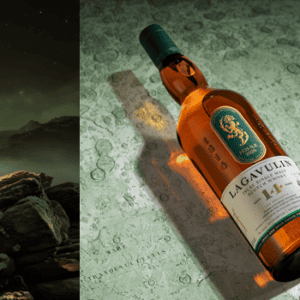
Visuals and imagery on a craft spirit label are more than just decorative elements; they’re essential tools for storytelling. A well-designed logo or mascot, for example, can become synonymous with the company, enhancing brand recognition and loyalty from your customers, as shown by Compass Box’s reimagining of their core collection, using creative illustrations for whiskies like The Peat Monster.
The use of illustrations, photography, and textures can help convey your brand’s narrative, evoke specific moods, and differentiate the product from competitors. The visuals you choose should reflect the character of the product, whether it’s fun and casual, refined and elegant, or quirky and unique. But you also need to be sure that the labels not only complement each other but also align with the overall packaging and bottle design. This consistency reinforces the brand’s story and makes the product instantly recognisable on the shelf.
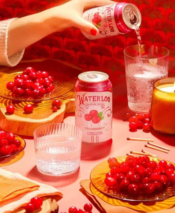
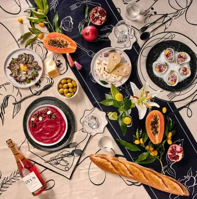

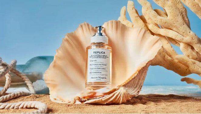
Photo Credit: MBP
Creating a cohesive omnichannel experience
With the world more digitally-forward than ever before, a brand’s presence needs to extend far beyond the physical store shelf. Your customers may encounter your products online, before they ever see them in person, so it’s essential to maintain a consistent visual identity across all channels. This is a great opportunity to tie in your digital marketing strategy with your content creation, from YouTube to social media and blogs.
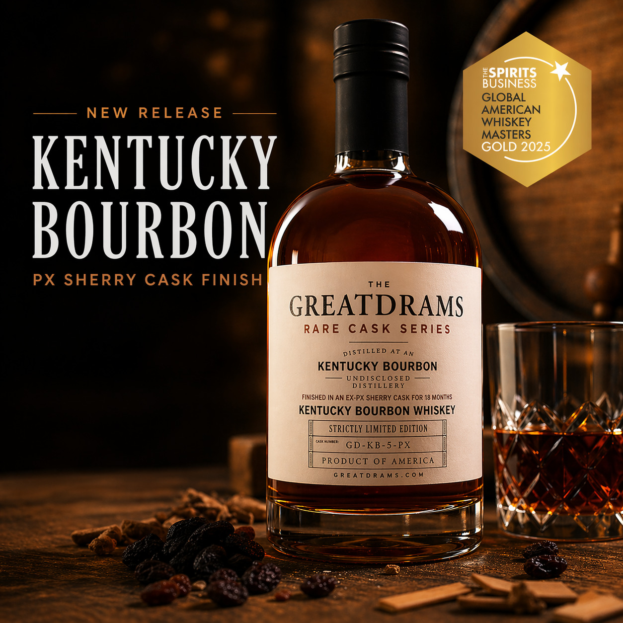
A cohesive omnichannel experience ensures that whether a consumer is shopping in-store or online, they receive the same impression of your brand. This might mean adapting your label design for digital platforms, where the product may appear as a small thumbnail or in a list of search results, or incorporating QR codes so customers can quickly land on your socials or website when they buy a product.
This offers additional opportunities for engagement, allowing consumers to explore the brand story, learn about the product’s origins, or even participate in digital promotions. Integrating design with the user experience also involves considering how the packaging contributes to the overall customer journey. For example, an engaging unboxing experience can enhance consumer satisfaction and foster brand loyalty.
The role of typography in label design
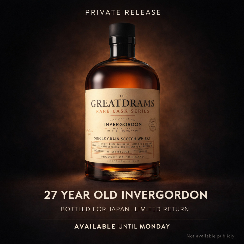
Typography is pivotal in label design because it serves as the visual voice of your brand. The font you choose can communicate a wealth of information about the spirit itself—whether it’s traditional and classic or modern and innovative.
Serif fonts often convey a sense of heritage and reliability, making them ideal for brands that want to emphasise tradition, while sans-serif fonts offer a cleaner, more contemporary look, appealing to a younger, trend-conscious audience. Handwritten script fonts, on the other hand, evoke craftsmanship and personal touch, which is particularly effective for small-batch or artisanal spirits.
Colour palettes and their emotional resonance
Colour is one of the most powerful tools in a designer’s arsenal—it’s capable of evoking a wide range of emotions and associations. In the context of craft spirits, the colour palette chosen for a label can significantly affect how a brand is perceived. For instance, warm colours like red and orange are often associated with passion and energy, making them suitable for bold, robust spirits.
In contrast, cooler tones like blue and green convey calmness and sophistication, ideal for brands that want to emphasise purity or relaxation. Cultural connotations also play a role; certain colours may hold specific meanings in different regions, influencing consumer expectations and preferences. For example, purple evokes luxury and richness, which is why Royal Salute used this shade for their Small Batch Collection.
Creating a cohesive colour palette involves balancing the need to stand out with the necessity of aligning with category expectations. While a distinctive colour scheme can make your brand memorable, it’s also important not to stray too far from the visual cues that consumers associate with specific types of spirits.
Don’t neglect the physical characteristics
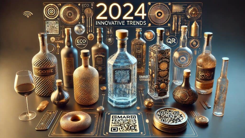
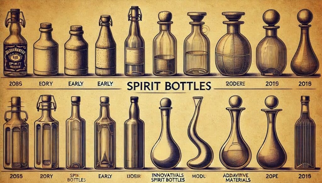
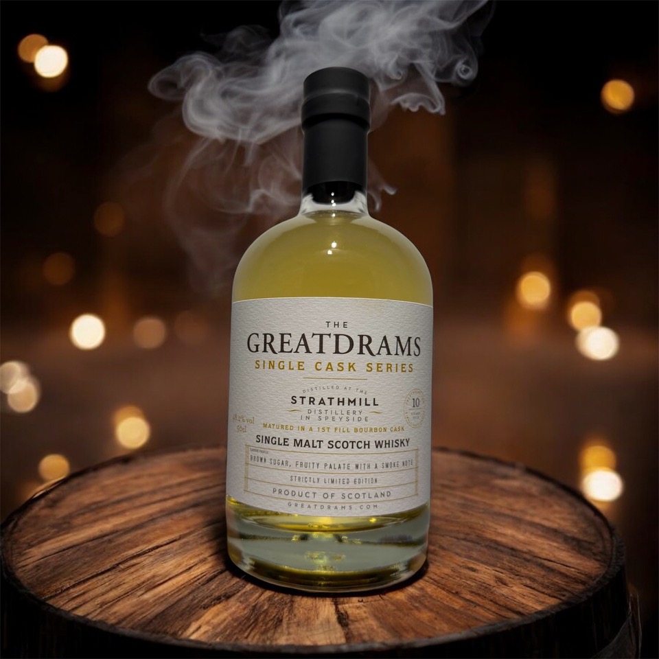
The shape of a bottle is one of the most immediately noticeable aspects of a craft spirit’s packaging, making it a critical factor in shaping first impressions. A bottle’s shape not only needs to fit within its product category—whether it’s whisky, gin, or vodka—but should also stand out in a way that is memorable and distinctive. In an industry where packaging is so synonymous with a brand, bottle shape plays a key role in creating recognition and recall.
Iconic spirits are often defined by their bottle silhouettes, and consumers can instantly recognise them even from a distance. For craft spirit producers, choosing the right bottle shape involves balancing tradition with creativity. While it’s important to align with category expectations, there’s also room for innovation that can set the product apart from competitors. Distinctive bottle shapes not only capture attention but also become part of the brand’s identity, making your product instantly recognisable and memorable.
In the highly competitive craft spirits market, a well-designed label is more than just a part of the packaging—it’s a powerful tool for communication. By carefully considering each of these elements, spirit brands can create labels that stand out on the shelf and resonate with consumers on a deeper level.
At Great Drams, you’ll find all manner of different whiskies, primarily Scotch, to suit all palates. For Whisky lovers and connoisseurs looking for a selection of rare, award-winning, limited-edition, Scotch Whisky, Great Drams has a huge selection of amazing drams to sample.
