25 of the best spirits ads in the world
let’s begin
Without ads how would we know which celebrities enjoy the same biscuits as us, or which shampoo will make our hair the shiniest? Ads are everywhere today. We’ve out together a collection of some of the ads that we think are the best spirit ads in recent decades. Which ones do you think work best?
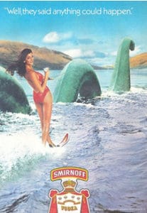
Smirnoff isn’t even Scottish, but they still managed to fit Nessie into their advertising. This ad makes Smirmoff out to be something different and to be the drink that offers adventure to those who enjoy it. This is abi more tongue in cheek than the usual ads we would see these days, but I think that makes us more appreciative of it. And lets be honest if we were offered the chance ot go water skiing with the Loch ness Monster, who would say no?!
Ok so this isn’t a spirit but it was too good not to include! It takes so many typical ideas and subverts them, all while creating the notion that this beer should be nurtured and considered on a higher pedestal than most. The images get slightly creepy if you look at them for too long, but I think it all adds to the effect really.
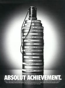
There were a lot of Absolut ads to choose from, but this one is particular is perfect. It conflates Absolut with the greatest of the great and gives it a foothold in history. This ad is also adapt at making us associate Absolut with any one of these films, which is great for them, since these are pretty commonly talked about. The abstract form of the bottle captured by the stack reels is also a nice graphic without being to obvious.
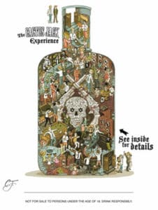
This ad is in a similar vein to the Gringos Tequila one and gathers a lot of imagery from Mexican culture to create a character for the product. The graphics here are especially good and I love the illustration. What they do better than the Gringos ad is giving the audience something to explore. While Gringos gave us enough to look at and take in, this goes further by swamping you with information and allowing you to fully explore it for yourself.
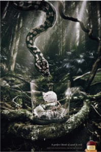
This is an ad that takes some time to think about. The message is that Pampero is a perfect blend of good and evil, and we as the audience have to translate that into the image. I like it because it looks good and it gives us something to focus on that isn’t the liquid inside the bottle, but rather the idea of what else is inside the bottle.
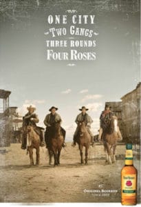
Four Roses create a wonderful image for themselves ehre and give their product a story. This at once takes you straight back to frontier times and gives you the impression that Four Roses was there at that time too. It also gives the drink a macho image that will definitely resonate with anyone who loves a good John Wayne movie!
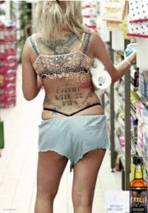
This ad is hilarious and just generally great at capturing the rough, tough, Devil-may-care attitude of Alibi Bourbon. It is also a distinctly American image, placing Alibi firmly in its Kentucky roots. Like many of the ads included here, Alibi have created a character that they want to people to associate their product with. Tis reaches a lot of different audiences, from those looking for a fun brand, to others who may relate more with the character that Alibi may have thought possible.
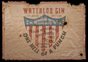
Again we have an American brand that is using patriotism and Americans’ own love of their country to market to them. the rugged old flag indicates the age and therefore quality of the Gin, a drink that is often associated with Britain. It also gives them a place to call home and shows a deep pride for that place, making any association with Britain that Gin may have immediately disappear.
Like a lot of big brands Hennessey have gained a glowing celebrity endorsement here. Martin Scorsese, although he may not be instantly recognisable, is definitely a name that we all know and appreciate. He comes with a ready made reputation and audience trust, so Hennessey gains all of the when they are seen to be associated with him.
Effen is definitely marketing themselves as a premium brand for younger audiences in this ad. The black and white filter with the ultra modern bottle design gives them an edge over older competitors. The focus on design and designers specifically is evident and gives the audience the idea that this is a brand that cares about more than taking money out of your wallet and actually wants to help the little guy on the street rather than the fat cats.
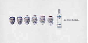
It can be quite controversial to use murderous dictators in ads, just ask Nandos and Robert Mugabe, but Amundsen attach humour to what they are doing. This ad works because it is not denying the horror of Stalin, but rather is saying that their method of distilling their vodka six times, can transform anything into something far more pure and clean.
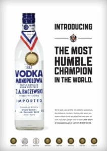
I think what I love about this ad is the hilarious irony. The most humble champion is obviously the brand with the medal around their neck and the awards lined up at the bottom right? Well for Monopolowa it is, and they are. I think this ad is the epitome of a humble brag and we only have to wonder whether it was intentional or not.
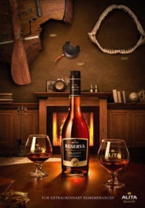
This ad has a lot to take in and I love that it builds up layers the more you look at it. The audience are given a hint at a story and allowed to fill in the blanks themselves, something that works to build up a character for the product as well. The story hinted at is quite unusual as well, with a shark jaw and frying pan involved, so that helps to make for something memorable as well.
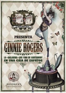
I love Hendricks whole look. They capture a lot about the history of Gin while at the same time creating a whole new world with a modern twist to it. This ad is along the lines of their usual aesthetic and is always giving the audience something to look at. Everything works here and there is a definite theme to the ad, which helps to tie the whole brand together.
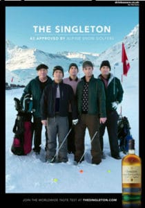
The worldwide taste test referred to in the tagline is perfectly captured in this ad. At first glance it seems a little strange but once you get to the tagline all becomes clear. I like this ad for its humour and the way it carries it out. The graphics look great and the message is clear.
A lot of spirits try to communicate their age and expertise but Martel seem to do it flawlessly here. We immediately conflate the past with the present and see how everything has remained the same, even Martel. There is almost no need for a tagline to tell us what they are saying, since the image is so good at relaying it.
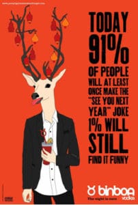
We get a greta idea of what Binboa are trying to say about themselves in this ad, even if it is a little strange at first. They give us a bogus statistic that we can all still relate to and that endears them to us. They pull apart the old societal norms of making bad jokes and allow us to final laugh at them and see how absurd they are.
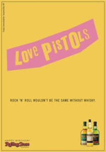
These das are great. They take well-known pop cultural icons and transform them into the complete opposite. Within this they use them to sell their own message, one that becomes instantly funny at the simple twisting of images that we’ve all seen before. This makes them seem just as iconic as the images they are changing.
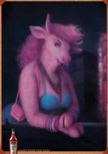
This ad is for their aperitif expression and this ad sums it up quick and easy. It literally makes beef “easy”. There really isn’t anymore to say except it must be very hard to make a cow look “easy” but I think Martini have given it a far shot. The only thing that perplexes me a bit is that she’s pink, but maybe that’s a reference to her being “rare”? you’llhav to figure it out for yourselves folks!
I love this ad. It is funny and plays up the brand name perfectly. It also makes everyone who’s ever felt like the black sheep of the family feel a little bit more accepted.
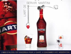
More from martini, only this one is a little bit more sophisticated than sexy beef. They really do make an art out of the serve and it almost appears like a deconstructed cocktail. It is simple and eye catching, with lots of different elements for the audience to look at. It is also a nice source of inspiration should anyone be feeling particularly creative!
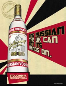
What could be better than playing with politics to promote vodka? The graphics of course recall the age-old communist propaganda that so many of us know and recognise. It uses this to create the idea of Russia in the mind of the audience and then plays on that by offering itself up to the UK but at the same time mocking their ability to catch Russians.
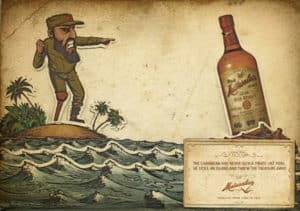
Mathusalem paint themselves very much as the hero in this image, against the communist dictator Castro. This is a brilliant way to use their history to their advantage and to create an interest around their origins. They ad copy is also well thought out and very witty, which helps to complete this as a light hearted and humourous take on what was probably a lot more complicated past.
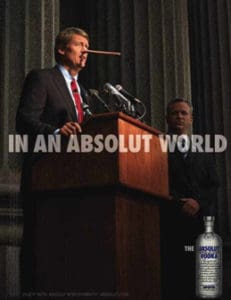
What better way to end than with a healthy dose of Absolut? This is just one of their wide range of “In an Absolut world” ads and it perfectly sums up the idea behind them all. In an Absolut world, things are pretty much like they would be in a perfect world, because of course Absolut is perfection. The ads work well with the ad copy and don’t take away from the brand, despite not really being associated with drinking.










1 thought on “25 of the best spirits ads in the world”
Greg I like the ads and arts concept of Pampero and Cactus Jack but Alibi Bourbon is different. Nice reviews.