STAUNING WHISKY UNVEILS A NEW DESIGN – AND BIGGER BOTTLE
let’s begin
The new bottle design illustrates the unique stories and processes behind the globally acclaimed Danish whisky
Stauning Whisky, the premium Danish distillery, has unveiled a new bottle design. It will be introduced to markets across Europe in September 2020, as it increases its export and brings the story of Stauning to new countries across the world. After moving to a new, purpose-built distillery in 2018, Stauning’s new bottle artwork is a tribute to its state-of-the-art site and has been designed to illustrate the unique stories and innovative processes behind this exceptional whisky made on Denmark’s west coast.
Increasing in volume from 50cl to 70cl, Stauning collaborated with Danish design agency Everland, Danish artist Asbjørn Staunstrup Lund, and British branding agency Jenkins Studio to create the striking new-look bottle to match the premium quality of the whisky within.
Stauning was started as a hobby in 2005 by nine Danish friends sharing an insatiable curiosity to experiment and push the boundaries of how to make great whisky. Together, they have created whiskies with a distinctive Danish character that reflect and celebrate its provenance. Its exceptional quality matches the finest whiskies from around the world.
Prolific whisky critic and writer Dave Broom says: “This is a whisky which truly speaks of its origins, its terroir. It even goes beyond the use of local ingredients and into the heart of what makes this spot on the earth’s surface different and special. Nowhere else makes a whisky like this. No one else can.”
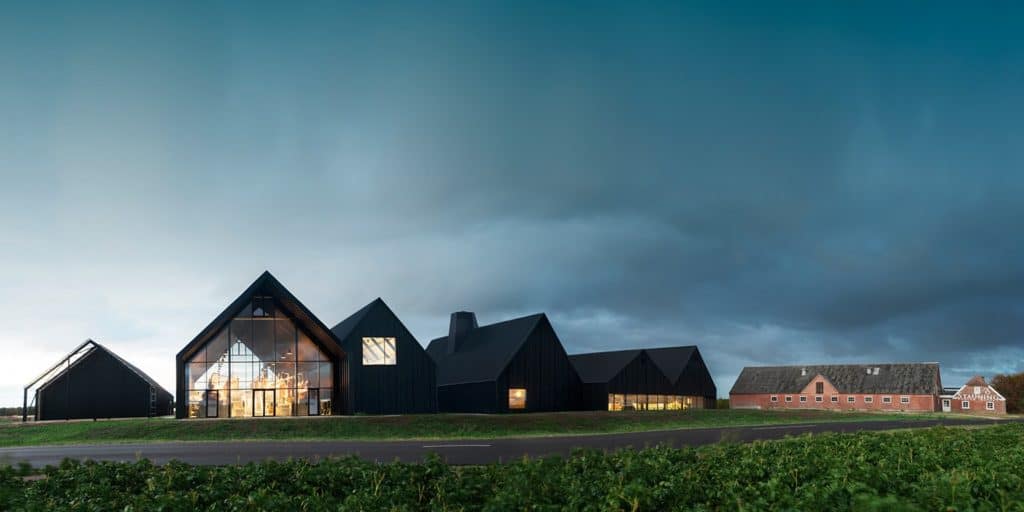
The refreshed design is unmistakably Nordic, featuring a striking black and gold label with a screen-printed illustration. It depicts each of the nine friends, as well as the whisky’s production methods, including the technique of floor-malting. This draws upon centuries of whisky-making tradition, but with a twist of Stauning ingenuity in the self-designed “malt turner”, now used to floor-malt the grains. The 24 small, direct-fired copper stills feature too, as well as several curious stories from Stauning’s past and present. Even the angled black section that wraps around the bottle represents the dramatically sloping, burnt-timber roof of the new Stauning distillery that itself draws upon classic Danish architecture, and is a nod to the fisherman huts found on the country’s west coast.
The new design will be rolled out across the core range: Floor Malted Rye Whisky, Floor Malted KAOS Triple Malt Whisky, and Floor Malted Peat Single Malt Whisky. The three expressions are differentiated by coloured bands across the bottom of the bottle – gold for Rye Whisky; deep red for KAOS Triple Malt Whisky; and green for Peat Single Malt Whisky.
Stauning co-founder Alex Munch says: “We wanted to find a visual way to tell the story of Stauning Whisky – something we’d never seen done before. It sets us apart as a Danish whisky which hails from the country’s west coast. The changes to the bottle represent us better than ever and gives our premium whisky a bottle it truly deserves.”
Greg
You might be interested in
More from the blog
Follow greatdrams
latest articles
Latest whisky
exclusively from GreatDrams
-
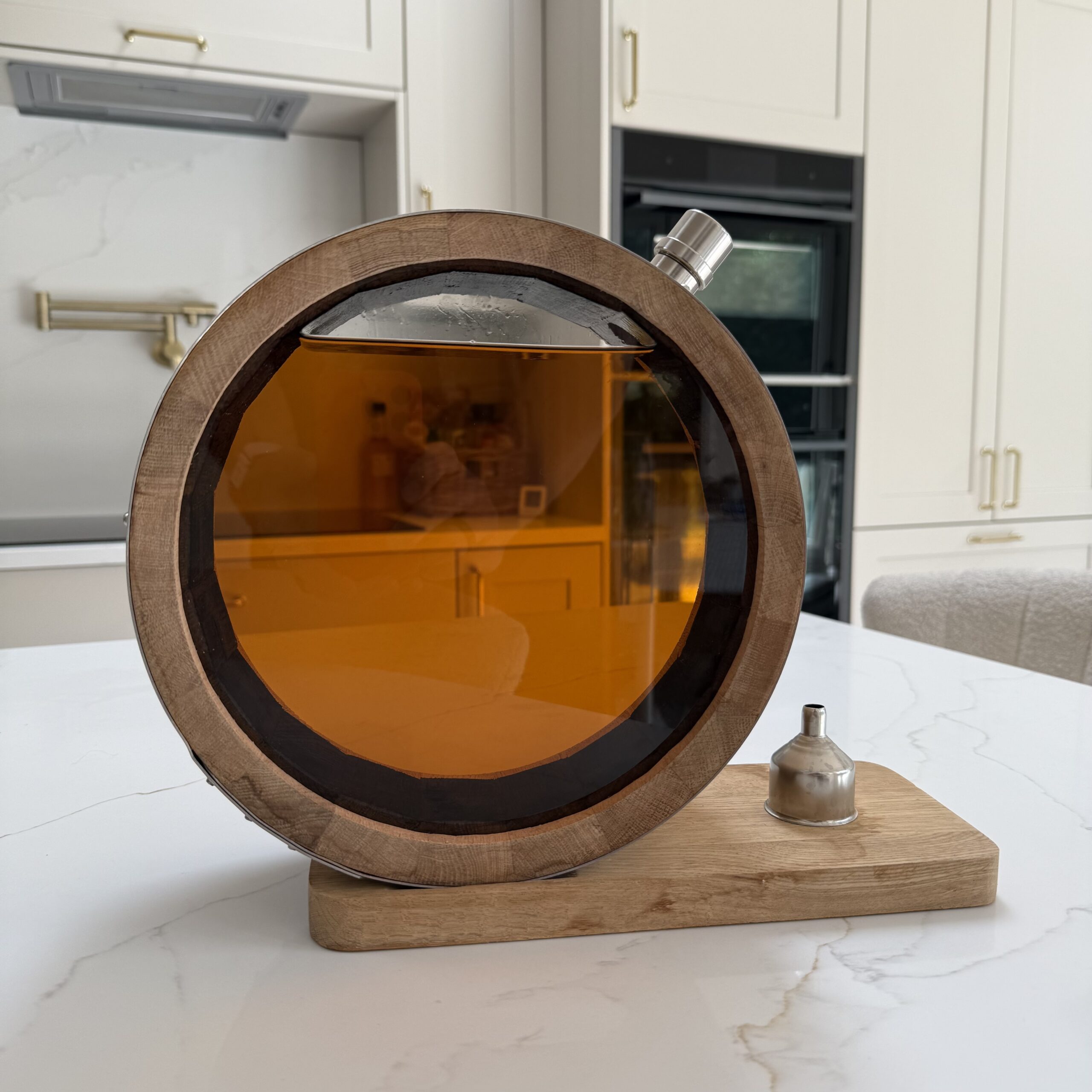
The GreatDrams Signature Barrel Decanter
£200.00 – £370.00


