25 Print Scotch Whisky Ads
let’s begin
Ever flick through a magazine and think about all the ads you see in one day? Some numbers say we see up to 500 adverts in a single day, which is an increase from a mere 500 in the 1970s. To make sure you see all the right ones, we’ve brought together some of the best magazine whisky ads for Scotch!
This whisky ad speaks to the aspirations of every Glenfiddich drinker out there. One day you’ll be able to drink a great dram like a Macallan, but for you now you can settle for Glenfiddich. I jest of course! But this ad is very good at showing Glenfiddich fans that they can reach high and Glenfiddich will be with them every step of the way!

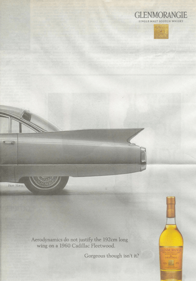
Glenmorangie are playing up the idea of nostalgia and aesthetics in this whisky ad. They hark back to a time that a lot of people idealise and use that to speak about their own brand. They try to evoke a carefree feeling that says all they care about is how amazing their product is, not about how to justify that.
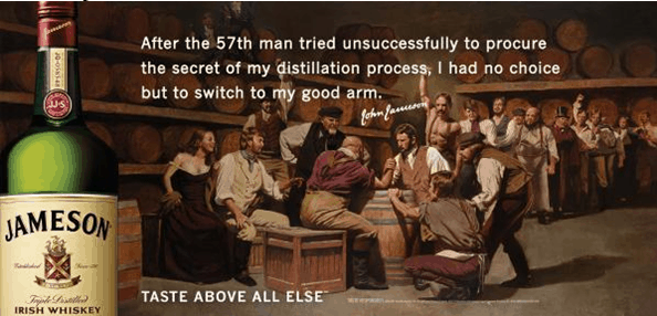
Jameson are fantastic at bringing together humour and character in their ads and this is one of the best examples of how they do that. They also place their product firmly in the past and evoke eras gone by to showcase their longevity and therefore quality. The Joke is the best bit about this ad, and it ties in very nicely with the aesthetics of it as well.
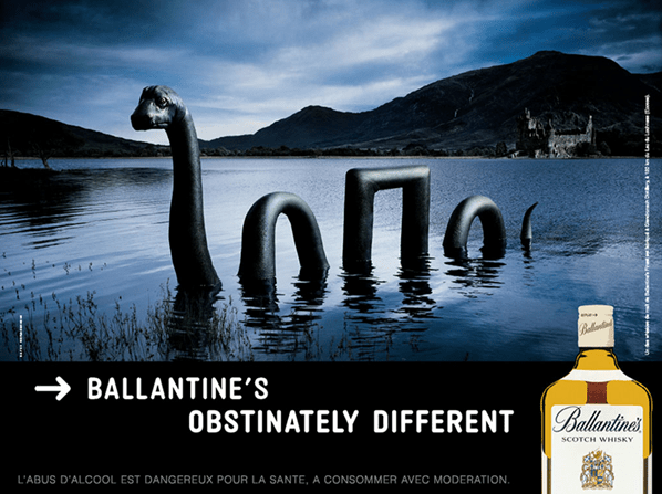
This is such a good ad. They bring together their Scottish roots and immediately align themselves with some of the countries oldest legends. As well as this they make themselves out to be unique from the competition, just like all of Scotland’s greatest legends are.
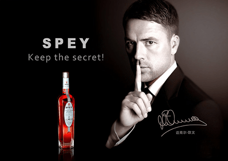
The word “amazing” does not translate when looking at this print whisky ad of Michael Owen shushing his audience in reverence to the great Spey Whisky. It is not so much amazingly good as amazingly bad, and that’s before we get to the fact that this is a video ad as well. The video is incredible, again, not in a good way, but in a way that should make Michael Owen rethink all of his life choices thus far.
Again, this is a humourous ad that captures both the manly character and the competitive attitude of Jim Beam. Not only do they take down competitors but they play on old stereotypes with wit and elegance. You can just imagine the gruff voice of some rugged war veteran bellowing this out in the background.
This is in a very similar vein to the Jim Beam whisky ad above, but also captures a good dose of patriotism along the way. The humour is there, the stereotypes are there and of course the Red, White and Blue are there. What more could one ask for from a Tennessee Whisky ad?
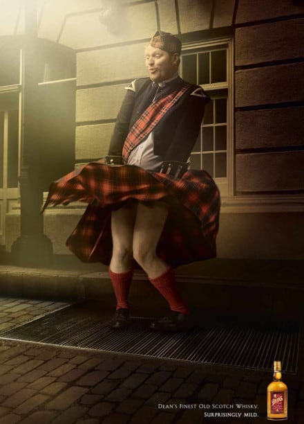
This advert is almost iconic. It captures a well known image and spins it on its head. To see a Scot posing like Marilyn Monroe is truly the image we have all been looking for. and it relates Deans back to its origins as well as setting it up to become just as iconic as the original photo is.
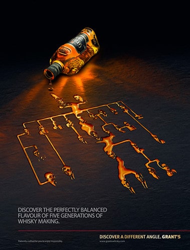
Grant’s focus a lot on their family but what this ad communicates is that their family is integral to the Whisky, that the liquid in the bottle is intrinsically related to the Grant’s. the graphics for this ad are also fantastic and the contrast between the dark background with the golden liquid is fantastic way to frame the Whisky as the most important part of the picture.
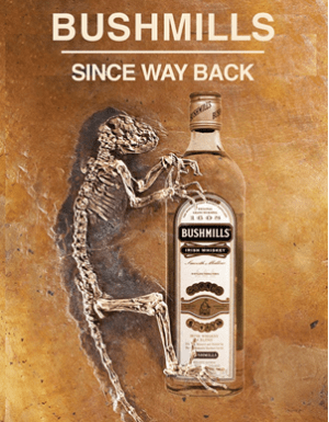
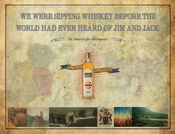
Bushmills are especially proud of being the first ever licensed distillery in the world. It is a fact they revel in, and this ad makes fun of that while pressing it home at the same time. The message is simple and to the point without complicating it anymore with unnecessary details or explanations.
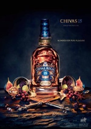
The graphics of this ad speak for the brand entirely. With lots going on, the flavour and complexity of Chivas is perfectly captured in one image. I also like the dark colours used, especially the deep blues and navy, which really speak out for the Regal side of the brand.
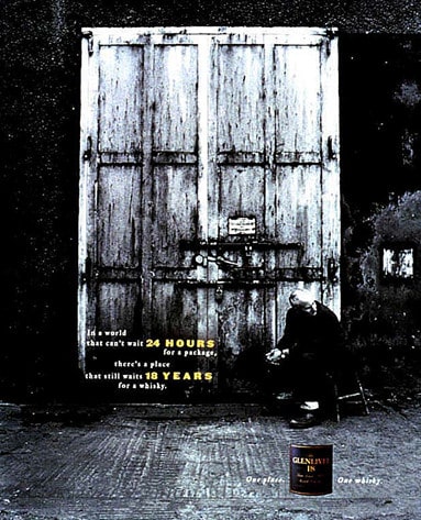
This ad tells us a lot about Glenlivet, despite its somewhat minimalist appearance. They capture the age, the dedication and set the product out as a throw back to the “good ole days” before everyone was so desperate for things to be by their side then and now. The black and white photos evoke a lot of drama but they have a good effect on the atmosphere, making it somewhat elevated and distorted.
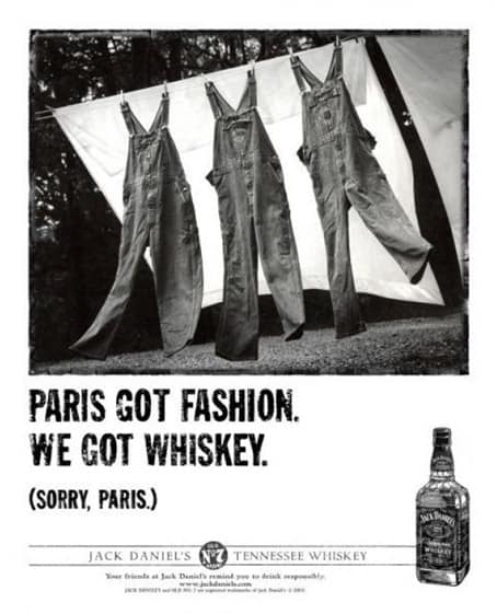
This is definitely an iconic shot. It comes in a long line of adverts in the same vein but perfectly captures the wit and character of Jack Daniel’s. This ad especially focuses on the provenance of Jack and it’s roots in Tennessee, conflating that with Paris and it’s connection to fashion. This is a nice, simple ad with humour and truth to it that really does turn Jack into that craft, family owned distillery just down the road fro us all.
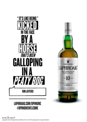
The Islay distillery Laphroaig have recently been plugging their opnions campaign which sees customers describe the brand as they see it. This has created some pretty humourous responses. This one, while not entirely hilarious, is still pretty good. It speaks to a lot of Whisky drinkers that want to prove their mettle at enjoying more hardcore peated expressions as well as the dedication that a lot of fans feel towards their favourite drams.
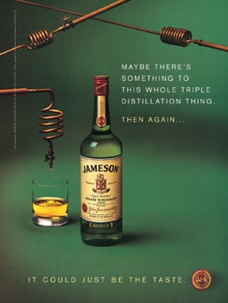
Another great ad from Jameson, this time showcasing their triple distilled qualities. The focus here is on the bottle and one of the things that differentiates Irish from Scotch and other Whiskies. The ad is laid out in such a way as to frame the bottle and keep the aesthetics in keeping with the recognisable Jameson brand, especially in the green background. The headline “It could just be the taste” is quite catchy as well, and short so as to be easily remembered.
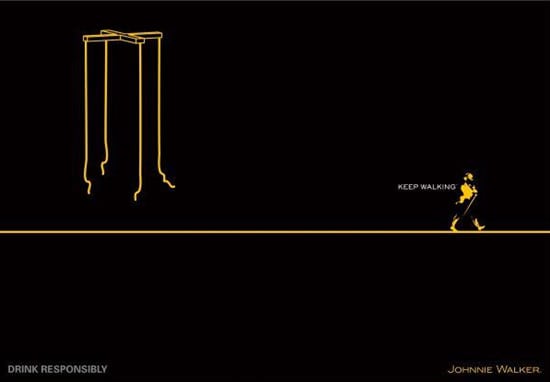
This ad is perfect in line with the brands TV ads, which focus on being in charge and to Keep Walking. I love the puppet ad as it communicates a clear message and Johnnie Walker becomes synonymous with that message of walking away from people who keep you tied down. The whole embodiment of Johnnie Walker can be felt in this ad.
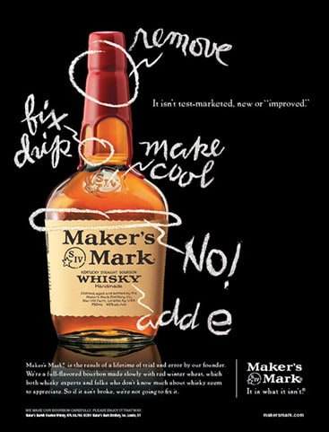
These ads by Maker’s Mark are so good. They are simple and straight to the point, each representing Maker’s Mark in a different way. And the bottles look so good against the black background. The Maker’s Mark bottle is made for this kind of imagery, with the bright red wax really making it look unique. Unlike a lot of American Whiskies, Maker’s Mark really owns itself in these ads. Since most American ads focus on patriotism, it’s refreshing to see one that wants to stand out for being itself more than anything else.
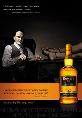
Although these are in Russian, I think the simple fact that Quentin Tarantino is featured in them makes them great. How can an ad not be cool with the director of Kill Bill in it? The one we include here even has feet in it, and could be a thinly veiled reference to Tarantino’s widely known foot fetish. Whether that makes you love Dewar’s more or less is really up to you.
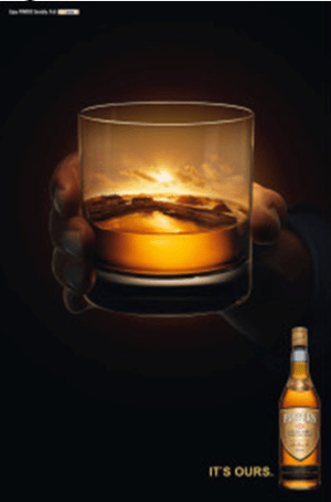
Well this ad really says everything you need to know about Power’s. To me there is a fiercely Irish mind set in their distinct reclaiming of the Whisky and this is extended to the customer. It’s ours, but it’s all of ours together. The hand reaching out is perfectly in line for a toast. If you look closely you can see a harbour and house in the glass, bringing you right back home and placing Power’s firmly in the hands of the customers.
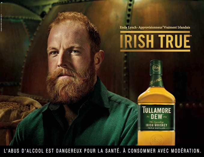
This seems to be a common theme in Irish adverts. The idea of “Irishness” and how the links to Whisky is a big thing for Irish brands and they often choose to show that in their branding. Alongside Scotland it is one of the oldest producers of Whisky and this is fact these brands love to claim. Green and gold also seem to be big factors, but if you’ve ever been to Ireland you’ll at least understand the green part. It is the Emerald Isle after all! This ad uses them well, as they compliment each other and the bottle perfectly.
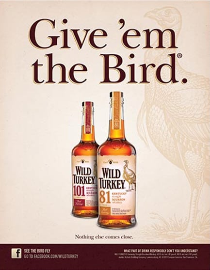
This plays on two things American’s love, flipping people the bird (middle finger) and Bourbon. This is funny in a teenager sort of way but that doesn’t mean it’s bad. It’s the kind of thing a kid would say to shock their parents and then pretend they were only saying it in reference to something else. But it works, and the brand becomes recognisable and memorable in an instant, because now every tim you give someone the bird, you’ll really be thinking of Wild Turkey.
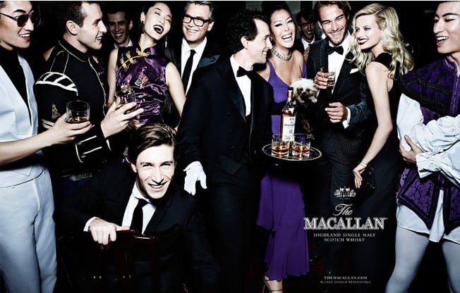
The Macallan came together with some pretty massive photographers to make these ads, including Annie Lebowitz and Mario Testino. This image in particular is by Testion and is just a fantastic ad for the Whisky. There is so much sophistication and glamour in these shots it almost spills out of the frame. But at the centre of it all is Macallan. This looks like a party we all want to go to and Macallan make us think that we can, if only we buy their Whisky.
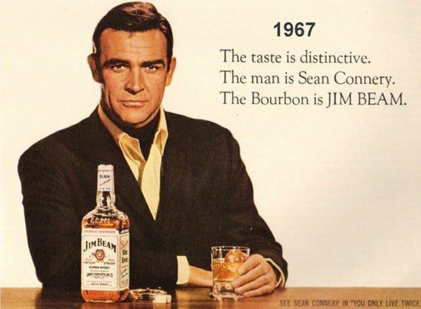
This ad has Sean Connery in it. Do I need to say anymore? If we could all look as suave and cool as him whilst drinking Jim beam I think it would become our dram of choice every time.
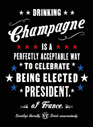
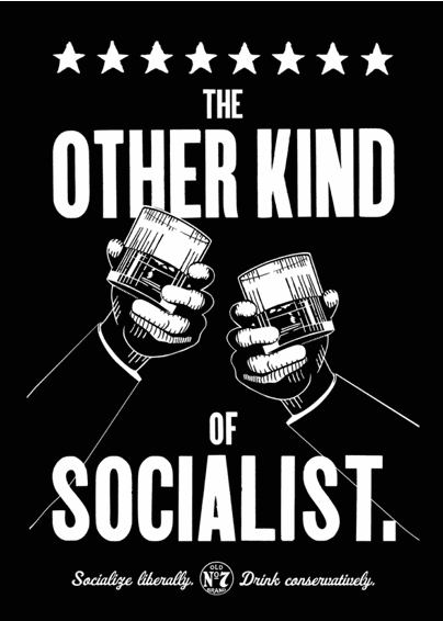
It isn’t very common for brands to get political, but Jack Daniel’s does, and they do it well. These ads are humourous with the ability to push them a little and think a bit deeper abut them. Albeit not too deep, but they do provide some room for thought. They also look great, and give Jack a good boost in a more modern aesthetic, even if it has a nostalgic twist.
This is my all time favourite Whisky ad. I may be biased because I too am from Northern Ireland. In this ad, Bushmills offers direct challenge to American Whiskies and does it the right way. They assert themselves and completely dominate the competition. There is simply nothing wrong with this ad, and if I could, I would have it printed out and stuck to my wall. (Again though, I may be a teeny bit biased.)







1 thought on “25 Print Scotch Whisky Ads”
Thanks, Greg. I enjoyed these old ads very much, even though I was actually looking for older whisky ads (not whiskey) from the 1920s or 30s
Keep walking!