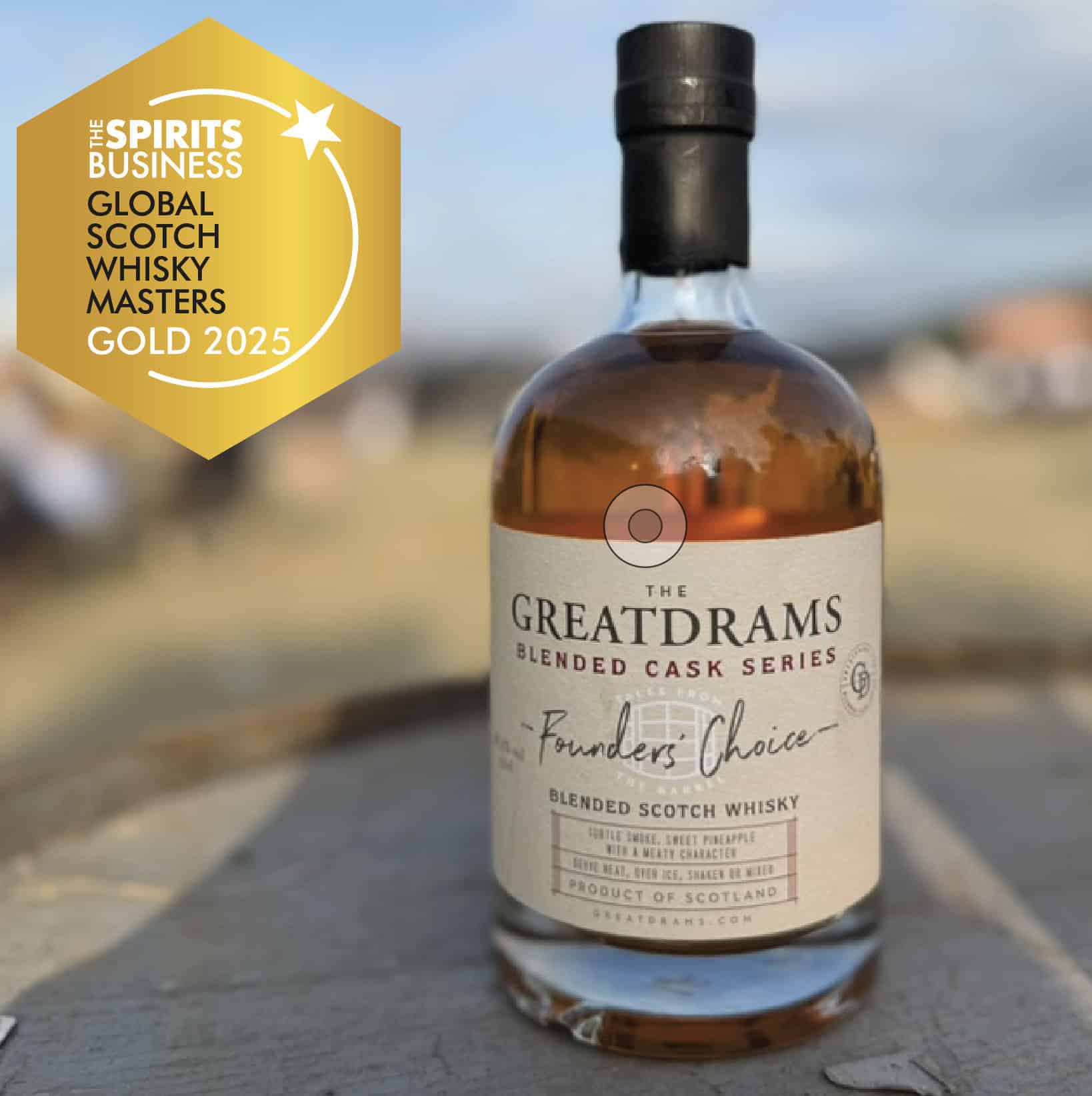
When it comes to business, if you’ve a product or service to sell, marketing and branding is so, so important. Don’t believe me? Just think of a certain fast-food chain with a giant yellow ‘M’ as one of their main logos. Now, I didn’t name any names, but I bet 99.9% of you know which chain I’m talking about. Well, in the whisky business, that same principle applies.
You might remember a while back, how I wrote about whisky labels and logos? Well, today I’d like to expand upon that a little bit, by looking at some of whisky’s more unusual and unique labels, logos, bottles, and brands.
Ultimately, when the whisky’s in your glass all that matters is the taste. Before that, though, it’s the bottle, it’s branding, and the label which may catch your eye and reel you in. To show you what I mean, here’s a look at some of whisky’s most iconic and recognisable labels and logos.
Maker’s Mark bourbon whiskey is one of the most recognisable bourbons currently on the market. This isn’t because of the label, as although very nice, it certainly doesn’t jump out at you. Instead, it’s because of the bottle.
You see, Beam Suntory’s brand of bourbon has a bottle that you’re unlikely to forget in a hurry. Why? Because the top is wax sealed in a brilliant red wax. The dripping red wax is not only there for aesthetic purposes, it’s also practical too, as it helps make the bottle airtight. What I also love about this is that no two drips are exactly alike. This makes every bottle unique.
Examine the wax seal a little closer, and you’ll see that in the centre is a small star to represent the star quality of the whiskey inside. Alongside this star are the letters ‘S IV’. These letters represent ‘Samuels 4th Generation’ which pays homage to the family heritage.
Staying stateside, we have a Tennessee whiskey this time, from one of the most iconic whiskey brands in the world – Jack Daniel’s.
Whether you love to sip it neat, or with cola over ice, the black and white label of the Old No.7 Brand is one of the most recognisable in the world. Considering it’s been around since 1886, that’s hardly surprising.
It isn’t just the label that stands out either, but rather the bottle. Each bottle comes in that signature square shape, with a label to match. As most other bottles are round or cylindrical, this too helps give Jack Daniel’s Tennessee whiskey a unique feel and eye-catching appearance.
Johnnie Walker is an iconic Scotch whisky brand, and whether you’re a fan of the red label, black, green, or any other colour, you’ll no doubt recognise the dapper-looking, top hat-wearing, striding man that represents the brand.
The striding chap on the label is synonymous with the brand, and I don’t know whether it’s his hat, his cape, his cane, or his demeanour in general, but I feel it just gives the brand a feel of class. Pay close attention to the direction he’s striding too, as that’s no accident. He’s striding left to right, to signify moving forwards, just as the brand has done since the Victorian era when it was first founded.
Another thing you’ll notice about the label itself, is how it isn’t straight. It is stuck diagonally to the square-shaped bottle at a 24-degree angle. This too is intentional as sticking the label diagonally meant more space for branding. It allowed for a larger label and helped the whisky to stand out against its competitors.
Think of a Scotch whisky brand that is synonymous with luxury, class, elegance, and sophistication, and you have to think of The Macallan. The whisky is widely considered one of the most luxurious in the world, and considering two of the most expensive whiskies ever sold, came from this very brand, you can definitely understand why.
The Macallan logo features an image of Easter Elchies House, which has served as the spiritual home of the whisky since 1824. The home overlooks the glorious River Spey and was owned by Patrick Grant, Lord Elchies, in the first part of the 18th century. It’s the simplicity of this logo that I really enjoy. It isn’t bold or over the top. Instead, it’s simple, classy, and sophisticated. It shows that the company is happy for its whisky to do the talking.
The typography is also elegant and stylish, often highlighted by vibrant golds to represent its pedigree. Gold is of course considered one of the most precious metals in the world, so of course the makers of the world’s most expensive whisky would use it in their branding.
So, there you have it, a quick look at 4 of the most iconic and recognisable whisky logos and labels. If you’d like to learn more about your favourite whiskies, or simply treat yourself to a dram or two in the process, head on over to GreatDrams.com and take a look at what we have to offer.
With an impressive selection of limited-edition, rare, and award-winning whisky, as well as heaps of whisky info on our blog, it’s the perfect spot for any whisky lovers out there.