How whisky packaging is evolving
let’s begin
For most of our readers, it’s probably not the whisky packaging that really matters when it comes to buying Whisky.
That being said, it’s also probably true that you appreciate a nice bottle and label when you see one.
A Brief History
Whisky packaging hasn’t changed a lot over the years, but like the saying goes, if it isn’t broken don’t fix it. With many brands having been around for over 100 years, their logos and themes have remained the same. This isn’t due to a lack of wanting to change, it’s simply good brand management.
Many Whisky bottles are fairly recognisable from their bottle structure – that’s bottle shape to non-design industry folk – although this is not exclusive to the spirit, or universally used.
Imagery surrounding Whisky has also remained fairly similar for decades, especially for Scotch. That is to say, it is full of tartan, bagpipes and heather, but in recent times that has evolved, storytelling has become more important as has flavour notes and descriptors being used in increasingly more interesting ways.
Glenfiddich were one of the first innovators in Whisky packaging, having hanged the shape of their bottle to a tround – or rounded triangle – in 1961. This really made it stand out and sales improved.
Where are we now?
Brands have mulled along for many years, but there has been somewhat of a revival in Whisky branding in recent years. No longer are brands turning to the tried and tested or relying on old imagery, instead they are reinventing the old and bringing in the new.
The bottles
First of all, they are taking a step back from the bulbous neck and the brown or clear bottle. Brands are turning to a whole range of colours and shapes to promote their drams.
There are countless variations of Whisky bottles these days, from the blue rectangles of Haig Club, to the rounded edges of Bruichladdich and everything in between.
The labels
The label tells you everything you need to know about a dram, so it’s only right that they should stand out and keep you interested. Labels have changed a lot over the years and there are some really unique whisky labels out there. Some of these are worth collecting just for themselves.
Take the recent releases from The Whisky Show. These labels were “lenticular”, meaning they were holographic and move. That is quite a difference from the faded, off white packaging of days gone by.
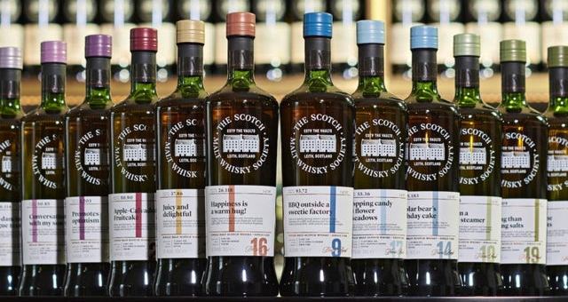
Or take the labels over at the Scotch Malt Whisky Society, which are colour coded and numbered to indicate certain distilleries and how many casks have been used from that distillery.
SMWS labels have been like this for a long time but they recently changed to bring in the colour coding, seeking to be more transparent, telling consumers everything they need to know about a dram.
Shifting Trends
Whisky is now reaching a much larger audience than it ever has and with that comes the need to diversify and become more universally appealing.
Reaching broader groups means that the labels need to be clear, but also that they should at least try to hold onto some of that tradition that has gone before them.
There is certainly a new move towards simplifying labels and bottling, as well as keeping them vintage. This is the way the industry is going at the minute, seeking to appear modern, but nostalgic at the same time.
What’s your favourite bottle design? Start the conversation in the comments!
What’s your favourite bottle design? Start the conversation in the comments!










2 thoughts on “How whisky packaging is evolving”